Moody Wedding Colors: Using Plum, Merlot and Black Without It Feeling Like Halloween
Some links here are affiliate links. If you buy through one, we may earn a small commission at no extra cost to you.
For about a decade the default wedding palette was pale. Blush, sage, ivory, a bit of gold. It photographed beautifully and it was very safe. That run is ending.
Pinterest published its 2026 wedding trend report earlier this year, built on billions of searches, and the colour data in it is not subtle. Searches for plum wedding themes are up more than sixfold. Plum paired with olive is up over thirteen times. Merlot, fig and muted terracotta are all climbing hard. Couples are choosing colours with weight in them.
The problem is that dark colours are easy to get wrong. There is a narrow line between a room that feels rich and a room that feels like a Halloween party, and most of the difference comes down to two or three decisions rather than the colour itself.
Here is how the palette works, where it goes wrong, and nine pieces that sit in it properly.
The mistake that makes it look like Halloween
Black and burgundy on their own read as costume. What stops that is warmth and texture.
Three things separate a moody wedding from a spooky one.
Metal, not plastic. Brass, antique copper and warm gold pull dark colours toward luxury. Silver and matte black push them toward Halloween. If you only change one thing, change the metal.
Something living. Real or convincing florals in deep tones keep a dark table from looking like a set. A black table with no greenery on it looks staged. Add eucalyptus or dahlias and it reads as intentional.
Light from below. Candles at table height, not overhead spots. Dark rooms lit from above go flat and grey. Dark rooms lit by twenty small flames look expensive.
Skulls, cobwebs and anything described as gothic decor will take you somewhere else entirely. That look has its own audience and we have a separate guide for it. This post is about the other direction.
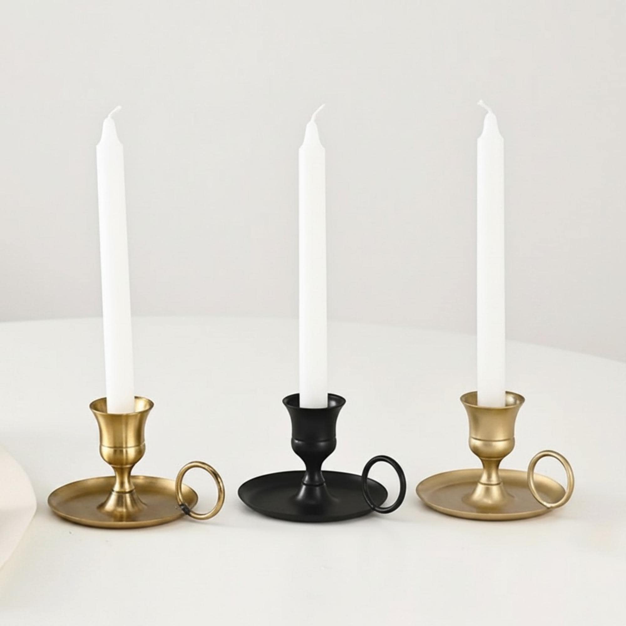
Brass and black candle holder
This is the piece that does the work described above. Brass finish, black body, at $16.99. Buy these in a run of eight or ten down a long table rather than one per table, because the effect comes from repetition and low light, not from a single statement object. The handheld shape also means guests can move them, which matters more than it sounds when tables get crowded.
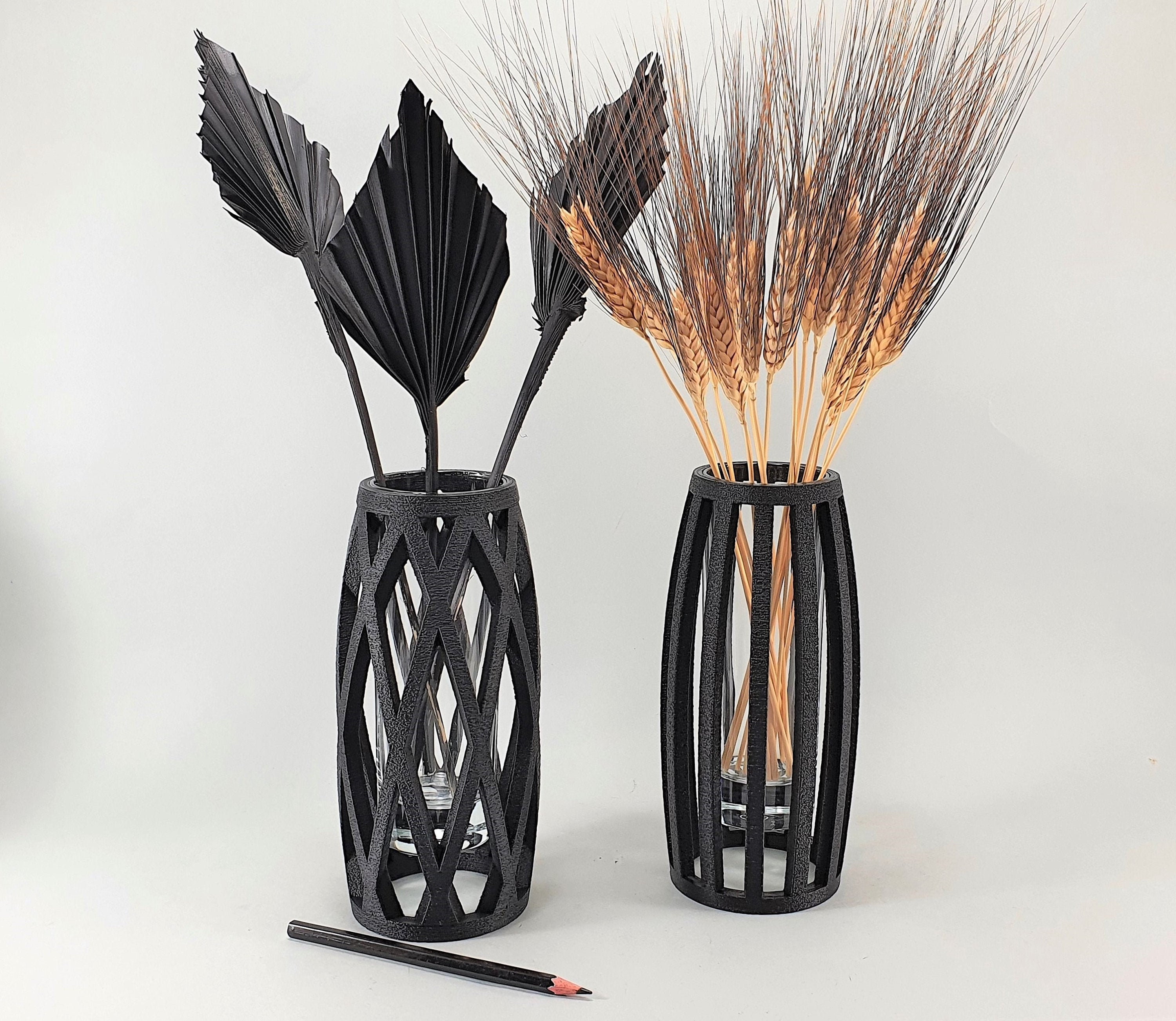
Black sculptural vase
Gothic & Celestial
12 pieces in this style, from favors to table decor.
Browse the collectionA 3D printed black vase at $29 with enough shape to hold a table on its own. Two or three of these with dark stems in them will do more than a full floral runner, and they cost a fraction of what florists charge for the same visual weight. Worth buying one first to check the finish in person, since printed textures photograph differently than they look.
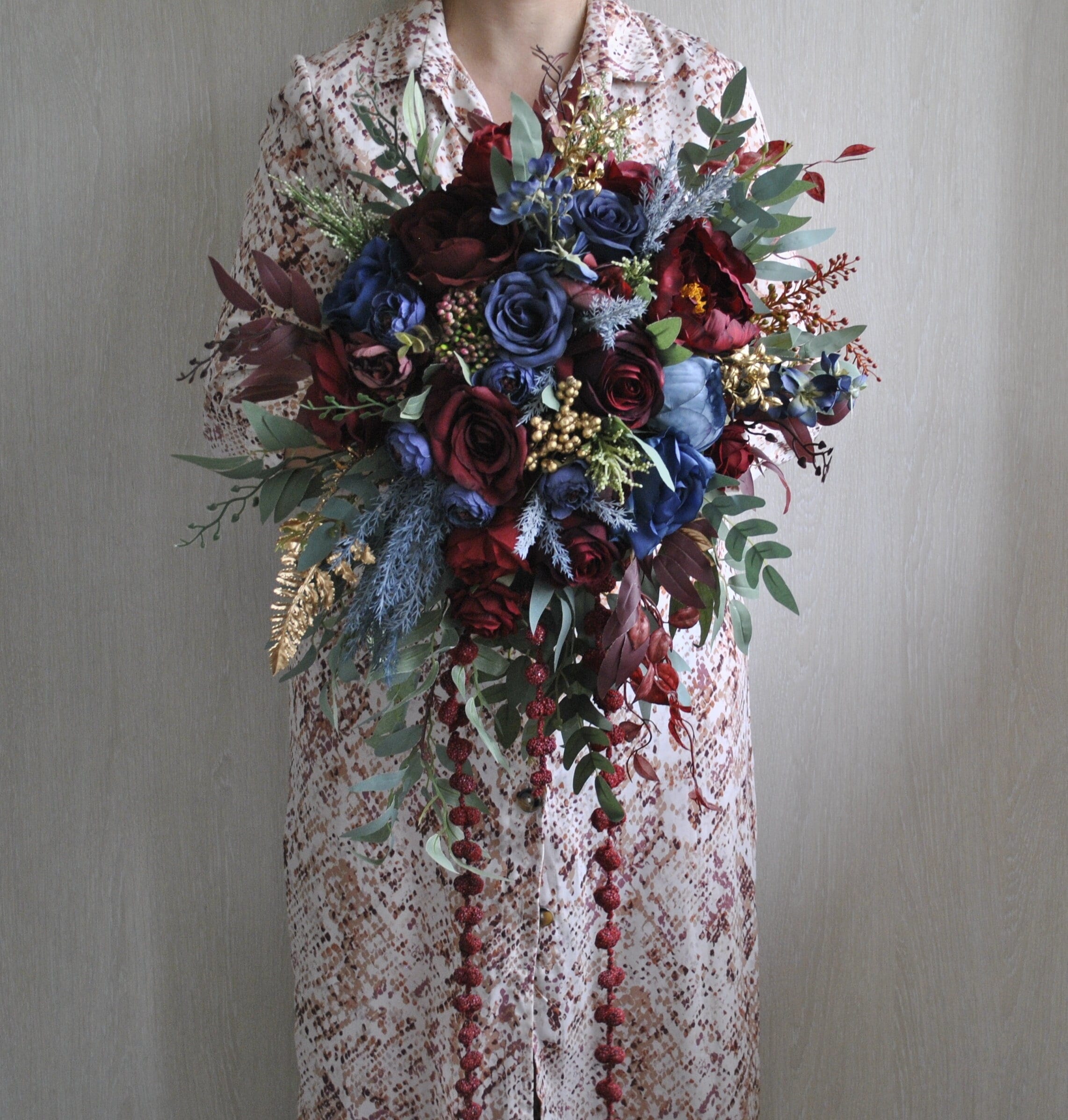
Burgundy and navy bouquet
Silk stems at $19. Burgundy against navy is the safest way into this palette because navy reads as formal rather than dark, and it is already familiar to guests. If you are nervous about going fully moody, start here and add depth later. Silk also means it survives a hot day and travels without water.
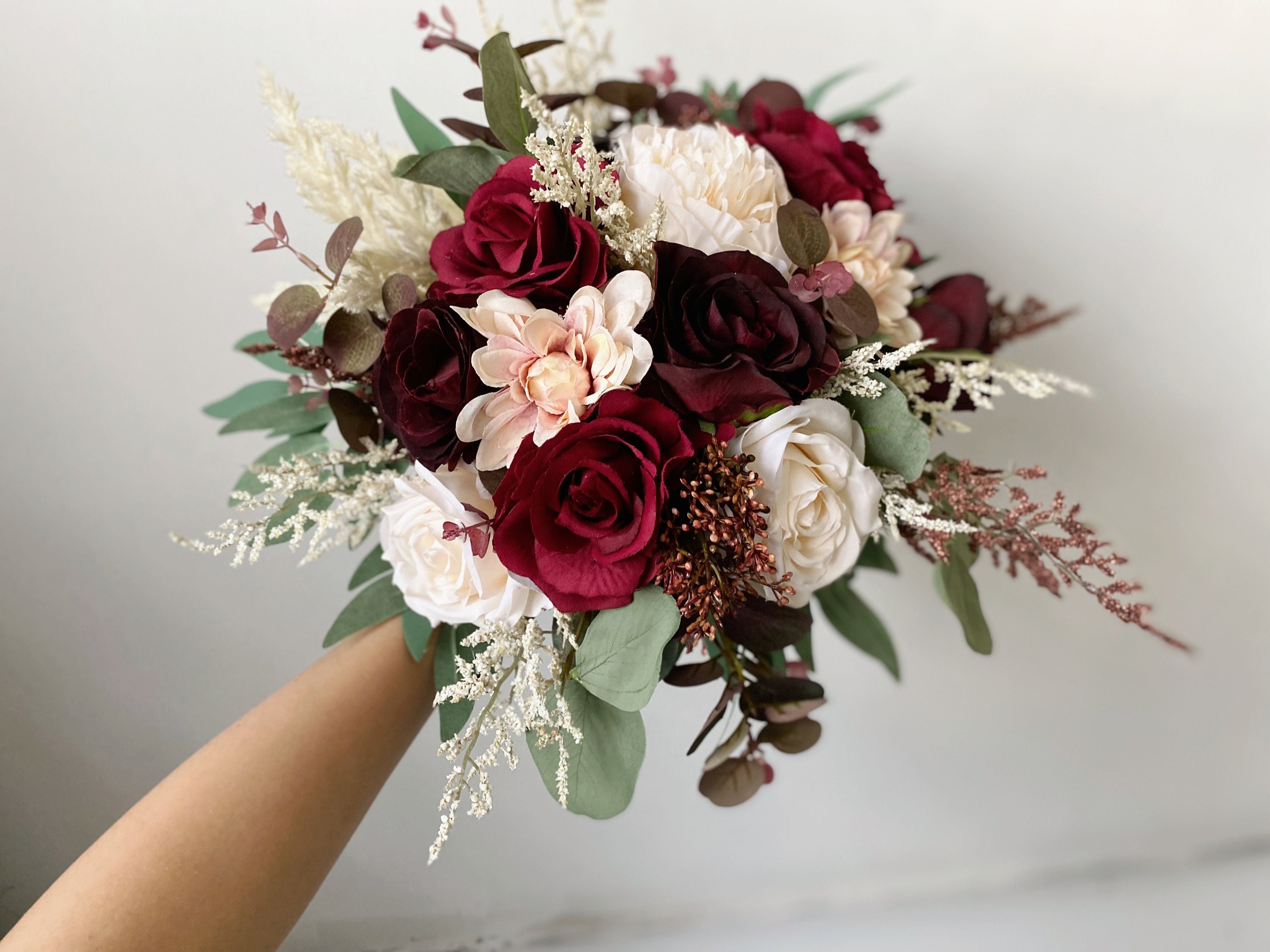
Burgundy and blush arrangement
At $10 this is the cheapest way to test the palette before committing. Burgundy with blush is the transitional version: dark enough to feel current, soft enough that nobody at the wedding thinks you changed the theme. Good for a bridal shower or an engagement party if you want to try the colours out on people first.
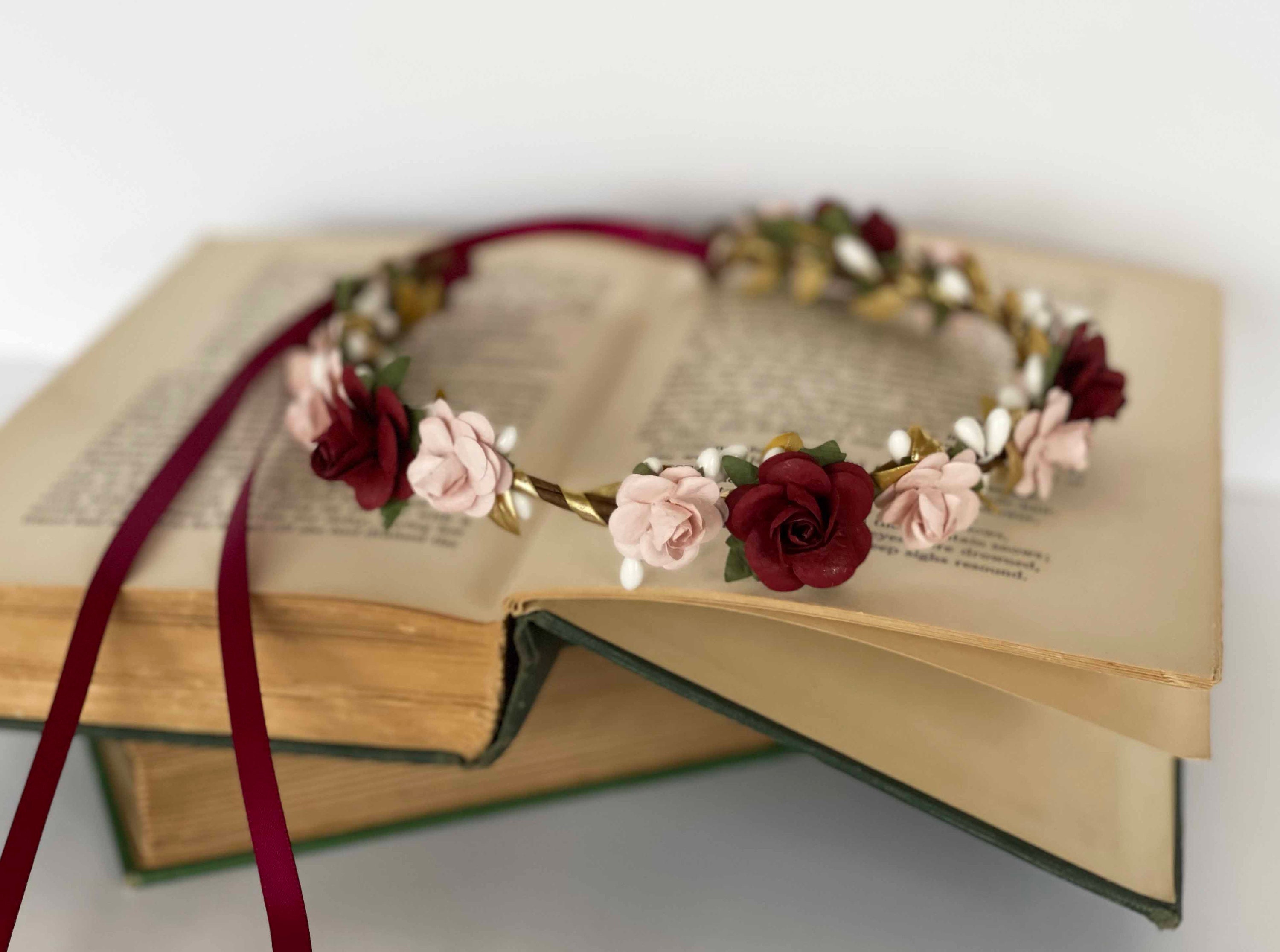
Burgundy and gold flower crown
Handcrafted, $44.99. A crown is a bigger commitment than most accessories and it suits some faces and some dresses and not others, so this is one to try before the day rather than order and hope. Where it works, it works hard: it carries the palette on the person everybody is looking at, which means the rest of the room can stay quieter.
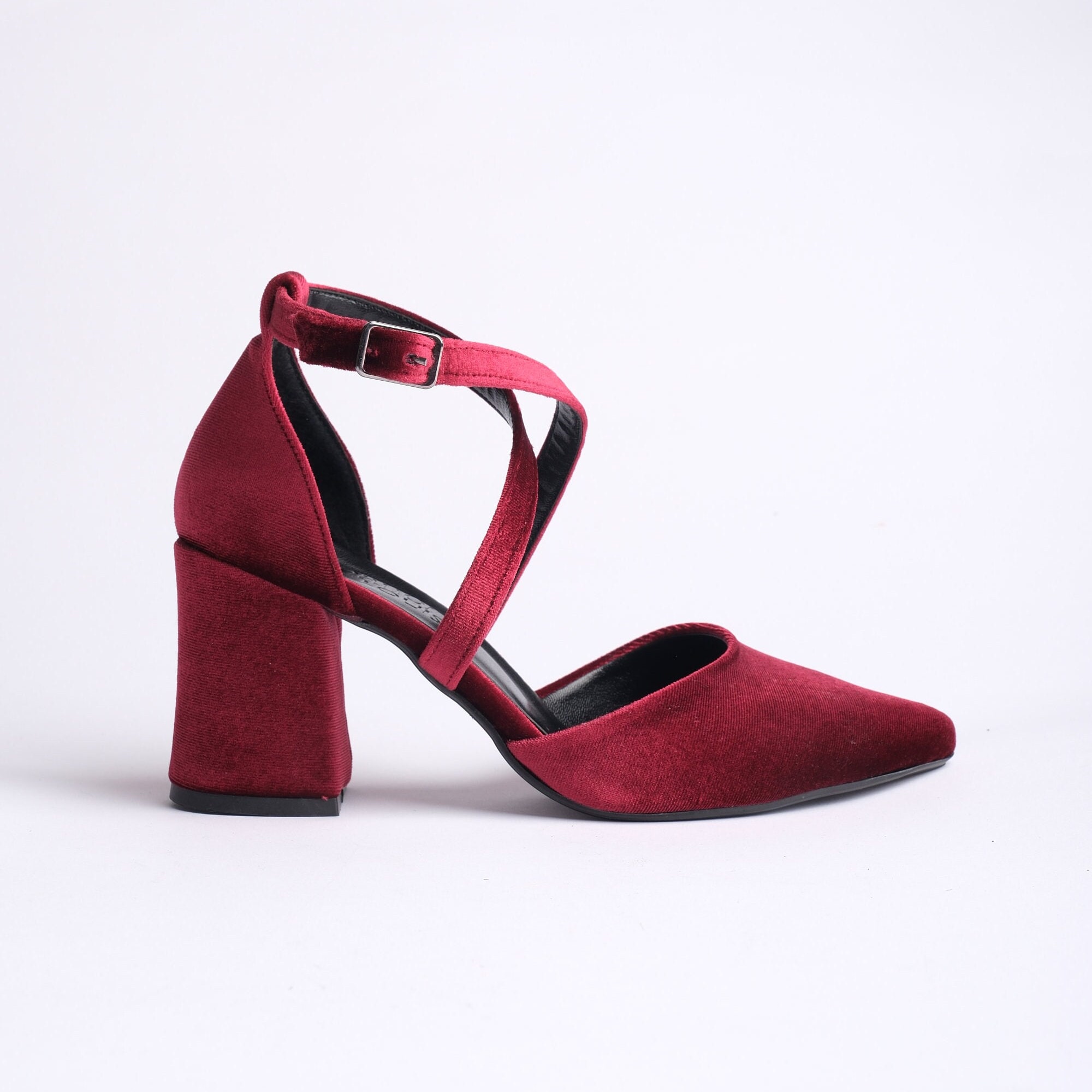
Burgundy velvet heels
At $129.99 these are not a small purchase, and velvet is the reason to consider them anyway. Texture is what keeps deep red from looking flat, and velvet in burgundy photographs with depth that satin does not have. They also work after the wedding, which is more than most bridal shoes manage.
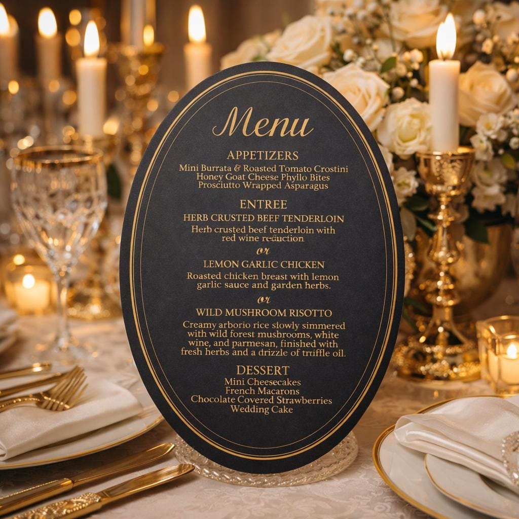
Black and gold menu cards
Menu cards at $28.99 in black with gold. Stationery is where this palette is easiest to justify, because paper is cheap relative to its visual impact and it sits on every single table. If your budget is tight, put the dark colours in the paper and keep the linen neutral. Guests read the table as dark either way.
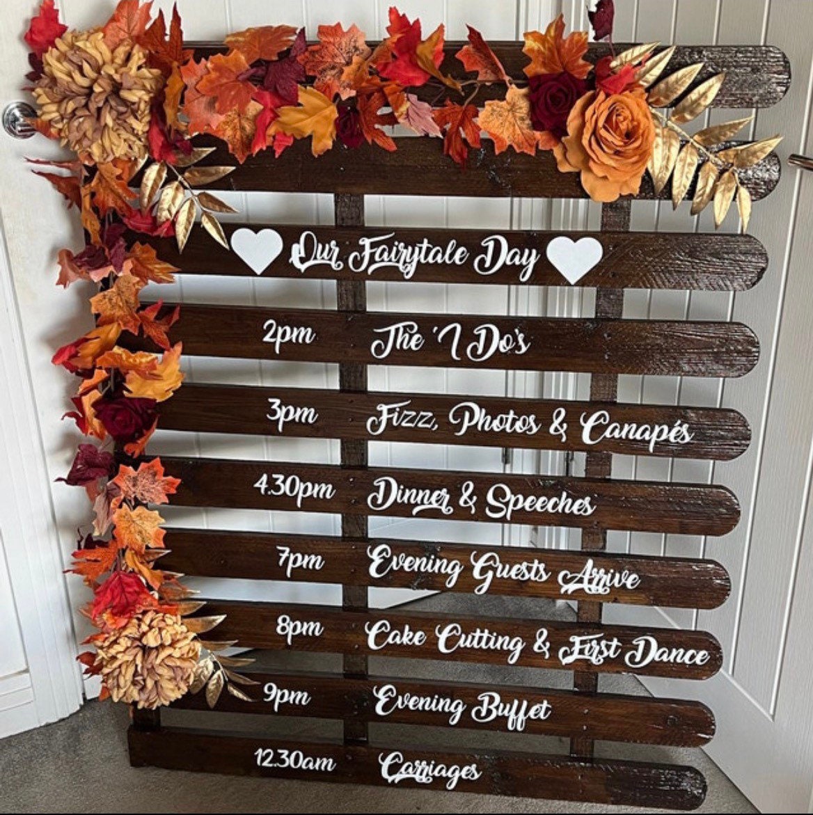
Order of the day vinyl sign
A personalised timeline sign at $26. Black vinyl on an acrylic or mirrored board is the cheapest large dark element you can add to a room, and it is genuinely useful rather than decorative. Order the wording early. Signs like this need proofing and a typo is permanent in a way that a napkin colour is not.
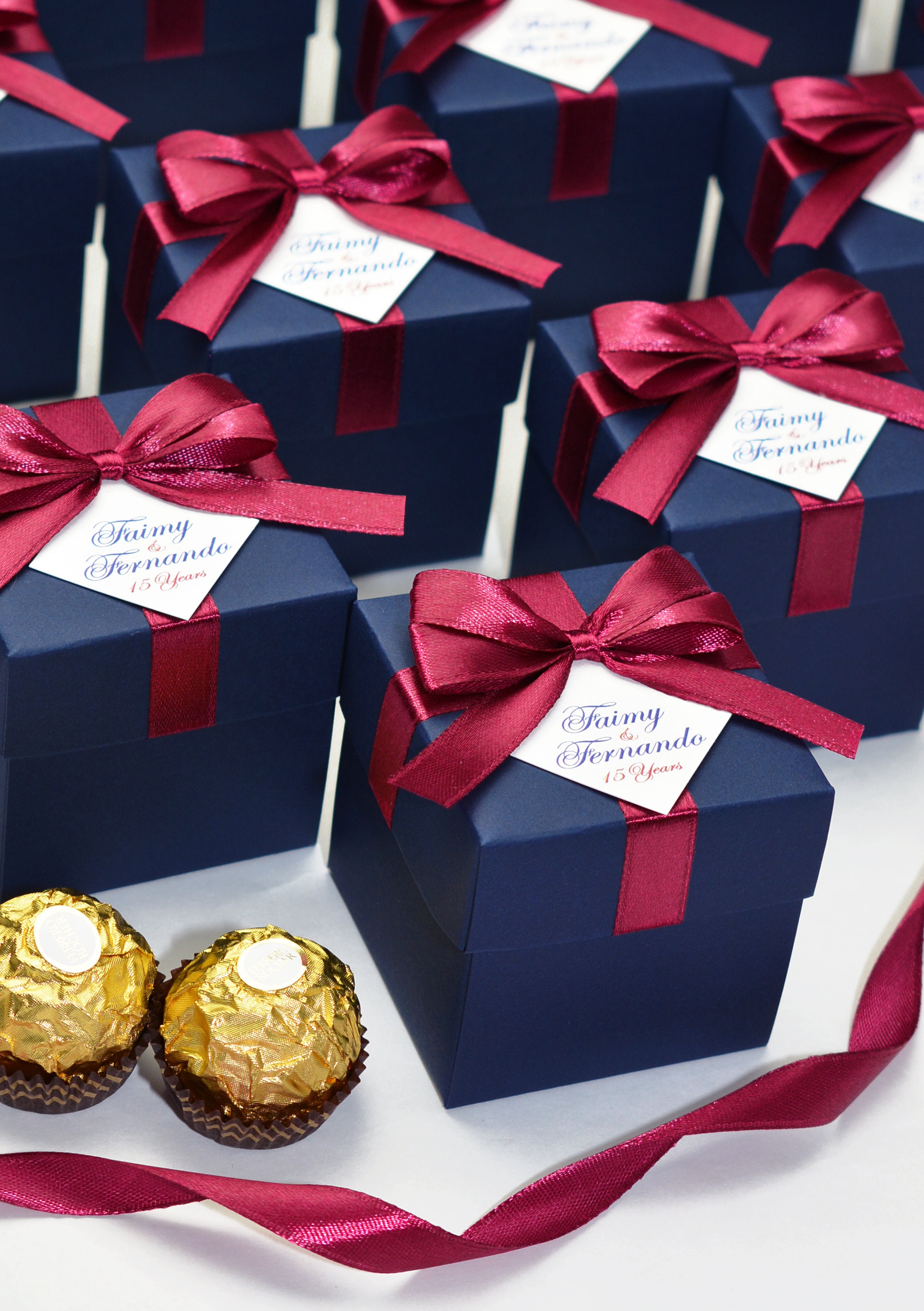
Navy and burgundy favor boxes
At $1.74 each these are the one item on this list that scales to a full guest list without hurting. Small boxes with satin ribbon in the palette colours, which means the favor itself can be anything cheap and the packaging carries the theme. This is the trick that makes a modest favor budget look deliberate.
How much dark is too much
A ratio that holds up in most rooms: roughly sixty percent neutral, thirty percent your deep colour, ten percent metal.
Neutral is the linen, the walls, the plates, the bulk of the space. The deep colour lives in flowers, paper, ribbon and a few objects. The metal is candle holders, cutlery and frames.
Couples who go wrong usually invert this. They put burgundy on the linen, which is the largest surface in the room, and then everything else has to fight it. Dark linen also eats light, so the room needs more candles than you planned for and the photographs come back murkier than the preview shots.
If you want one bold move rather than a spread, make it the flowers. They are the element guests get closest to and the one that photographs best in deep tones.
Which season this actually suits
Autumn is the obvious answer and it is not the only one.
Autumn is easiest. The light outside is already warm and low, so a dark room feels continuous with the season rather than fighting it.
Winter works well indoors, especially in the evening. Pair with brass rather than silver unless you specifically want the cold version.
Summer is the hard one. A deep palette in a bright outdoor marquee at 2pm looks heavy. If you have a summer date and you want these colours, push the reception later and let the palette arrive with the evening.
Spring can work in the burgundy and blush direction rather than the black direction. That is the version in the arrangement above.
For the seasonal versions of this, we have separate guides on winter colour schemes and navy and fall palettes, and if you want the same mood on a tight budget the black and white approach gets you most of the way there for less.
Common questions
Will dark colours make our photos look bad?
Only if the room is lit from above. Tell your photographer the palette in advance and ask about their approach to low light. Most will already have an answer. Venues with high ceilings and downlights are the ones to be careful with.
Is burgundy the same as merlot or plum?
They overlap and vendors use the words loosely. Burgundy leans red, merlot leans darker and browner, plum leans purple. Order swatches rather than trusting product photos, because screens shift all three toward each other.
Can we do this in a bright modern venue?
Yes, and it often looks better there than in a dark barn. White walls give the deep colours something to sit against. The version that struggles is a dark venue plus a dark palette, where everything merges.
What about the bridesmaid dresses?
Deep tones are unusually forgiving across skin tones and body shapes, which is part of why they have taken off. Burgundy and plum both photograph well in groups. Black is fine and no longer reads as funereal to anyone under fifty.

Kaden is an interior designer in her education who fell in love in designing weddings. Along with her husband, the wedding planner, Kaden specializes in creating content for weddings aim to fulfill brides dreams.